Before smartphones and tablets were common, having a website that adapted to pocket-sized screens was optional. Now, almost 60% of online traffic in the US is from mobile devices. Your center is trying to reach on-the-go parents whose smartphones are rarely out of reach. To connect with these parents and capture their contact information, you need to optimize your website for mobile devices’ smaller screens.
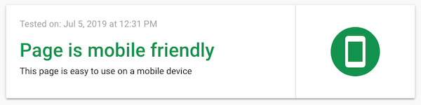
Tip: Not sure if your website is mobile friendly? Visit Google’s Mobile-Friendly Test to see if your website passes the test.
Making your website mobile-friendly sounds like a big undertaking – and it used to be.
In the past, website designers and developers would create two separate websites for a business, one for computers and one for mobile devices. Building and maintaining two websites was a lot of work. Changes had to be made on both the desktop-sized website and the smartphone-sized website. Even with all this work, there was no guarantee your website would look good on an “in between” size screen like a tablet.
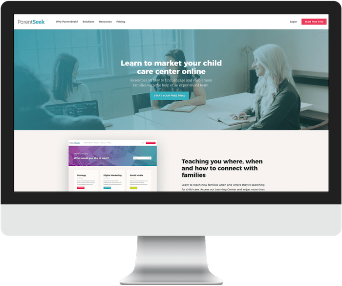
Today, delivering a hassle-free website experience for parents is simple, thanks to a technology called responsive design. This technique allows websites to respond to the size of the screen a visitor is using. When you use responsive design, you have a single website that dynamically changes to fit computers, tablets and smartphones.
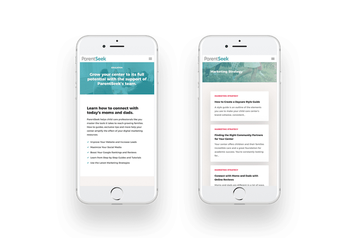
Not only are you impressing busy parents with responsive web design – Google prefers it too! Google ranks websites based on the mobile version. This makes it very important to keep the information on your website consistent across all sizes. If information disappears when a mobile device accesses your website, on-the-go parents and Google miss out on it. When you use responsive design, elements simply shift to fit a screen, instead of disappearing.